Does this appear
I’ve always loved maps. At one level they are simply beautiful artefacts. More importantly they make sense of our world. They help us understand intuitively the world around us and the ways in which it has been moulded in the past and could be moulded in the future. Maps also give us the opportunity to see new connections that otherwise would remain unseen.
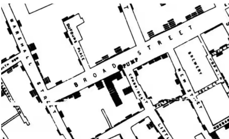
John Snow’s 1854 map of the London cholera epidemic showed that deaths were clustered, and that at the epicentre of this cluster was the Broad Street Water Pump (in today’s parlance, he created a heat map). Up until this time, the spread of cholera was believed to airborne. Mapping the deaths pointed the finger at the true culprit, providing the clues to preventing further outbreaks, and saving countless lives.
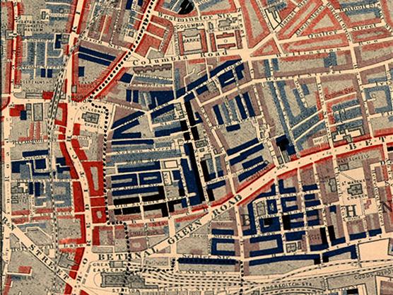
Maps reveal truths about our environment but these truths are not just about the physical but also the social. From Charles Booth’s 1898 Map Descriptive of London Poverty through to the Indices of Multiple Deprivation currently used, cartographers have seen the value of exploring how deprivation is spatially concentrated. Exploring these maps over time is an interesting exercise to see how poverty persists in some areas but in others dissipates. What are the reasons for these different experiences? We may think we know, but mapping can test assumptions and in mapping we may also discover new connections.
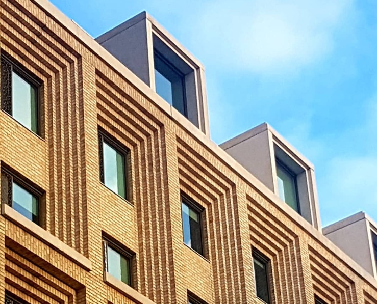
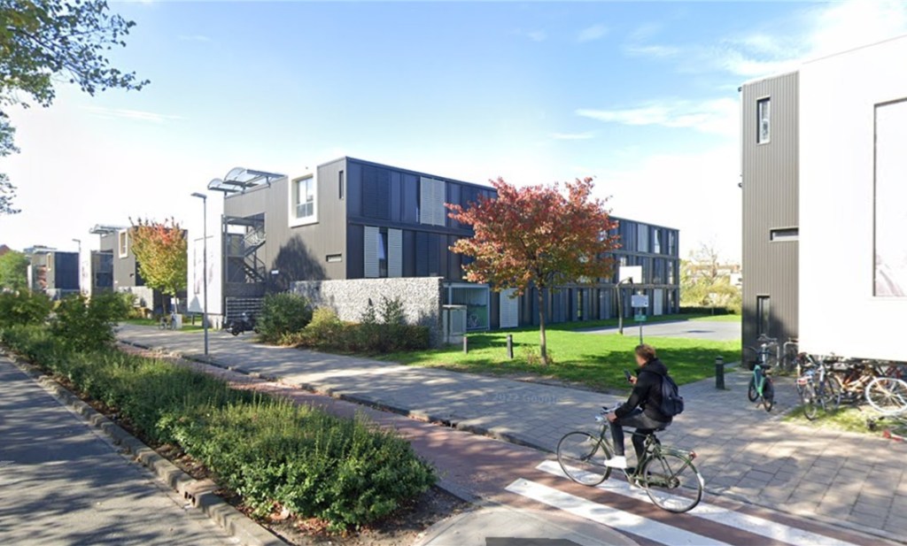
Several years ago when I worked for the University of London, I was asked to create a series of maps of the Higher Education Estate that various stakeholders could use to support their planning. This would help universities to engage both with each other but also with local and regional government partners. The GLA at the time had a dedicated mapping department producing maps on a huge variety of subjects, including school provision, transport connections (including PTAL scores) and Housing Land Availability ( the SHLAA) . What it didn’t have was a map of was a map of the Higher Education Estate and ancillary buildings (Purpose Built Student Accommodation).
A part of the aim of the project was, as the saying goes, to put Higher Education on the map. Rather than