
I’ve always loved maps. At one level they are beautiful, visual artefacts. Maps can also be invitations to adventure. Distant, crinkled coastlines, dense forests and snow capped mountains, all annotated, measured, described and put on the page (web or paper). They beckon us in the cold, dark months to travel and leave our grey, little island behind.
For me, though, the maps of places we think we know, can be just as exciting and revealing. Done well, maps can help us better understand the world around us. Urban maps in particular can reveal to us connections between people and places that otherwise would remain unseen.
Urban Maps
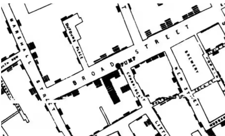
One example of this is John Snow’s 1854 map of the London cholera epidemic. This map showed that the deaths were clustered, and that at the epicentre of this cluster was the Broad Street Water Pump (in today’s parlance, he created a heat map). Up until this time, the spread of cholera was believed to be airborne. Mapping the deaths pointed the finger at the true culprit, providing the clues to prevent further outbreaks, and save countless lives.
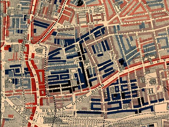
Maps reveal truths about our environment and these truths are not just about the physical but also the social. From Charles Booth’s 1898 Map Descriptive of London Poverty through to the Indices of Multiple Deprivation currently used, cartographers and politicians have seen the value of exploring how deprivation is spatially concentrated. Exploring these maps over time is an interesting exercise to see how poverty persists in some areas but in others dissipates. What are the reasons for these different experiences? We may think we know, but mapping can test assumptions and in mapping we may also discover new connections.
My maps
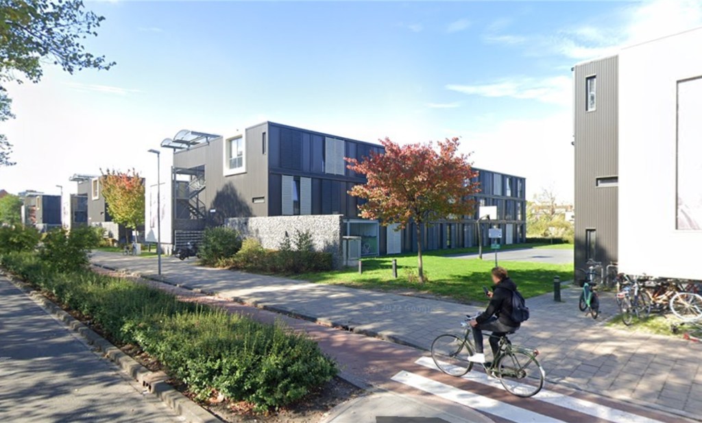
Several years ago when I worked for the University of London, I was asked to create a series of maps of the Higher Education Estate that various stakeholders could use to support their planning. This would help universities to engage both with each other but also with local and regional government partners. The GLA at the time had a dedicated mapping department producing maps on a huge variety of subjects, covering land use, transport connections (PTAL scores), demographics and the environment . What it didn’t have was either a map of the Higher Education Estate or one showing where students lived.
A part of the aim of the project was, as the saying goes, to put Higher Education on the map. By showing the sheer physical scale of the HE sector, the age and listed status of our buildings, our new construction projects, the number of students and where they were living, all of this, it was hoped, would make discussions with local planners and politicians less abstract. It would get their attention.
At the time, I had zero knowledge of mapping software or how to go about the project. I did, however, have a fantastically talented intern from the French Oxbridge for the civil service (ENTPE). This intern, taught me the basics and helped me design and document the methodology.
Unfortunately, even with his help, we still needed to map over 1000 buildings, process data on over 450,000 students and combine all of this with dozens of other datasets. Maps are hard work. We may not have been trekking through a jungle with a compass, but there were times when it felt like that might have been the easier option.
In the end though they worked. At meetings with planners, private developers and politicians, the maps served as an introduction. It turns out that everyone loves a map. They also served to fill small but important gaps in people’s knowledge. They built confidence and developed narratives, they helped people to see. They may not have prevented an epidemic but they did help to visualise how Universities impact on the local communities in which they are situated.
More recently, on my PhD I have used mapping to assess the impact of Vacant and Derelict Land on local communities and just last month (April 2025), I completed the first stage of a mapping project for the University of Bath. This latter project was very similar to that carried out for the University of London. You can see the latest iteration of the project here, with a User Guide here.
I am a cartophile, a fan of the power of maps to help us see and interpret the world around us. They may be hard work, but like many things that require concentration and attention to detail, they can be enormously useful. They act both as a prompt for dialogue and discussion and as a means to develop narratives rooted in a sense of place. They are also, for me at least, tremendous fun.

Leave a comment